Color with Intent: A Photographer’s Guide to Seeing and Grading
By Alex Harper • 10 min read
Color is a language. As a Photographer, you can speak it by design rather than by accident. That means choosing a palette before you shoot, capturing clean color in camera, and grading with a light touch that guides emotion without crushing skin or detail. This is a practical approach you can apply to portraits, travel, and brand work alike.
Start with a palette
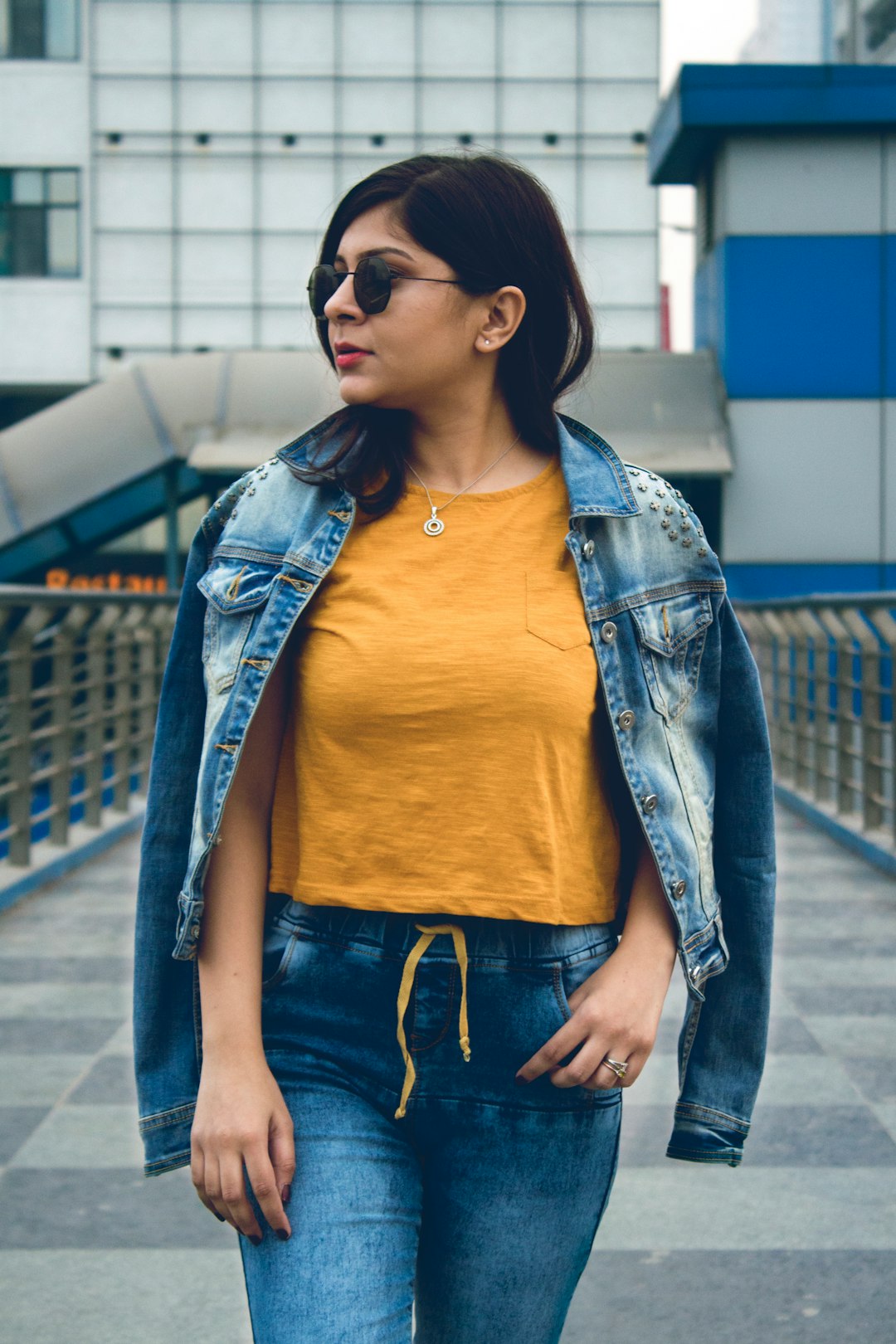
Instead of asking “what looks nice?” ask “what does this story feel like?” Translate that feeling into a simple palette: a dominant color, a supporting color, and an accent. Dominant sets the mood (warm amber, cool blue, natural green). Supporting builds harmony (sand, slate, olive). Accent pops where you want attention (bright scarf, neon sign, red door). Three is enough; more becomes noise.
Wardrobe matters as much as location. If your background is cool concrete and dusk, a warm coat becomes the accent. If you’re shooting in autumn leaves (already saturated), dress the subject in neutrals so the environment sings without competing.
White balance is mood—lock it
Auto WB constantly nudges toward neutral. That can erase the very warmth or coolness you chose. Set Daylight outdoors and let the scene keep its character, or dial a Kelvin value: 5200–5600K for balanced daylight, 6000–6500K for a cozy evening, 7000K if you want unmistakable warmth. For mixed light interiors, pick the dominant source and match it; we’ll unify the rest with gels or in the grade.
Gels: the secret handshake
If you use flash, consider CTO/CTB gels to match or contrast ambient light. A 1/2 CTO on flash in blue shade warms faces naturally. A CTB in a sodium‑orange alley balances your key to the ambient so skin looks plausible. The goal is not weird color; it’s harmony. When light sources agree, the grade becomes smooth instead of surgical.
Expose for color
Overexposure washes saturation; deep underexposure pushes colors into noise. Place midtones where skin looks believable and watch the histogram for channel clipping—if the red channel spikes hard, you’ll struggle to recover lips and blush. If your camera offers highlight‑weighted metering, try it at sunset to keep oranges from blowing out while you lift skin in edit.
Shoot a reference, save an hour
A grey card or color checker seems fussy until you import a mismatched set. Shoot one frame per lighting setup. In editing, sync white balance and a camera profile from that reference across the scene. This anchors skin and keeps your palette consistent across angles and focal lengths.
Grading: HSL first, then finesse
Global saturation is a blunt tool. Instead, steer colors gently with HSL:
- Oranges: Tiny hue shifts affect skin more than any other color. Keep them near neutral; lift luminance slightly for glow.
- Yellows: Guide foliage and city lights; tame saturation to avoid neon greens.
- Greens: Push a touch toward yellow for organic scenes, toward blue for ciné cool.
- Blues: Raise luminance to avoid banding in skies; keep saturation moderate so skin doesn’t cyan‑shift in shadows.
- Reds: Watch lips and logos. A small luminance drop adds richness without clown tones.
Use the tone curve for contrast rather than the clarity slider. A gentle S‑curve adds punch while leaving micro‑textures (like skin) intact. Save local clarity and texture for hair, brows, and fabrics that can handle it.
Split toning and the color wheel
You don’t need to memorize theory, but complementary pairs are useful: orange/teal, red/cyan, blue/yellow. If your scene is warm overall, a whisper of cool in shadows can balance it; if it’s cool, a hint of warmth in highlights feels human. Keep it subtle—if someone can name the look at a glance, it’s probably too heavy for most work.
Skin first, everything else second
People read faces with astonishing sensitivity. Anchor skin tones before you push creative moves. If the face is right, your grade can get bolder in the environment. If the face is wrong, no palette will save the frame. Use a small desaturation brush to calm reds around noses and chins, and a tiny increase in luminance to bring life without flattening.
Color management on export
Deliver in sRGB unless you have a print pipeline that specifies otherwise. It’s the safest space for web and mobile. Export a social preset (long edge ~2048px, JPEG 80%) and a portfolio preset (~3000px) to preserve gradients. If your skies band, add a touch of noise (1–2%) to dither the gradient.
Build your color voice
Collect frames you love and study the palette: what dominates, what supports, how do accents appear? Try to recreate those relationships on your next shoot. Over time you’ll notice patterns—perhaps you like warm skin in cool environments, or earthy palettes with a single saturated accent. That becomes your color voice. Clients hire voices, not sliders.
Color is not an afterthought. When you pick a palette, lock white balance, and grade with HSL and restraint, your images feel intentional. That’s the difference between pictures that look corrected and photographs that feel designed.
← Previous: The Science of Sharpness Back to Blog Next: Street Photography Ethics →